



A corporate website may be designed around desktop, tablet and mobile layouts, but users do not experience websites in three neat categories.
They browse at 1,440px wide monitors, 1,100px laptops, 900px tablets, 768px screens and 375px phones — along with countless sizes in between. Browser windows can also be resized, split-screen layouts are increasingly common, and content does not always behave predictably within a fixed design.
That raises an important question for website development: should a site be built responsively, adaptively, or with a combination of both?
Understanding the principles of responsive web design can help teams create websites that adapt to these changing conditions without relying on a fixed set of device sizes.
For most modern corporate websites, responsive development should provide the foundation. Rather than designing around individual devices, it allows content and layouts to respond to the available space. Breakpoints and adaptive techniques can then be introduced where a particular component needs more deliberate control.
The goal is not to make every screen look identical. It is to make the experience work well wherever it is viewed.
Responsive and adaptive design are not the same thing
The terms responsive and adaptive are sometimes used interchangeably, but there is a useful distinction.
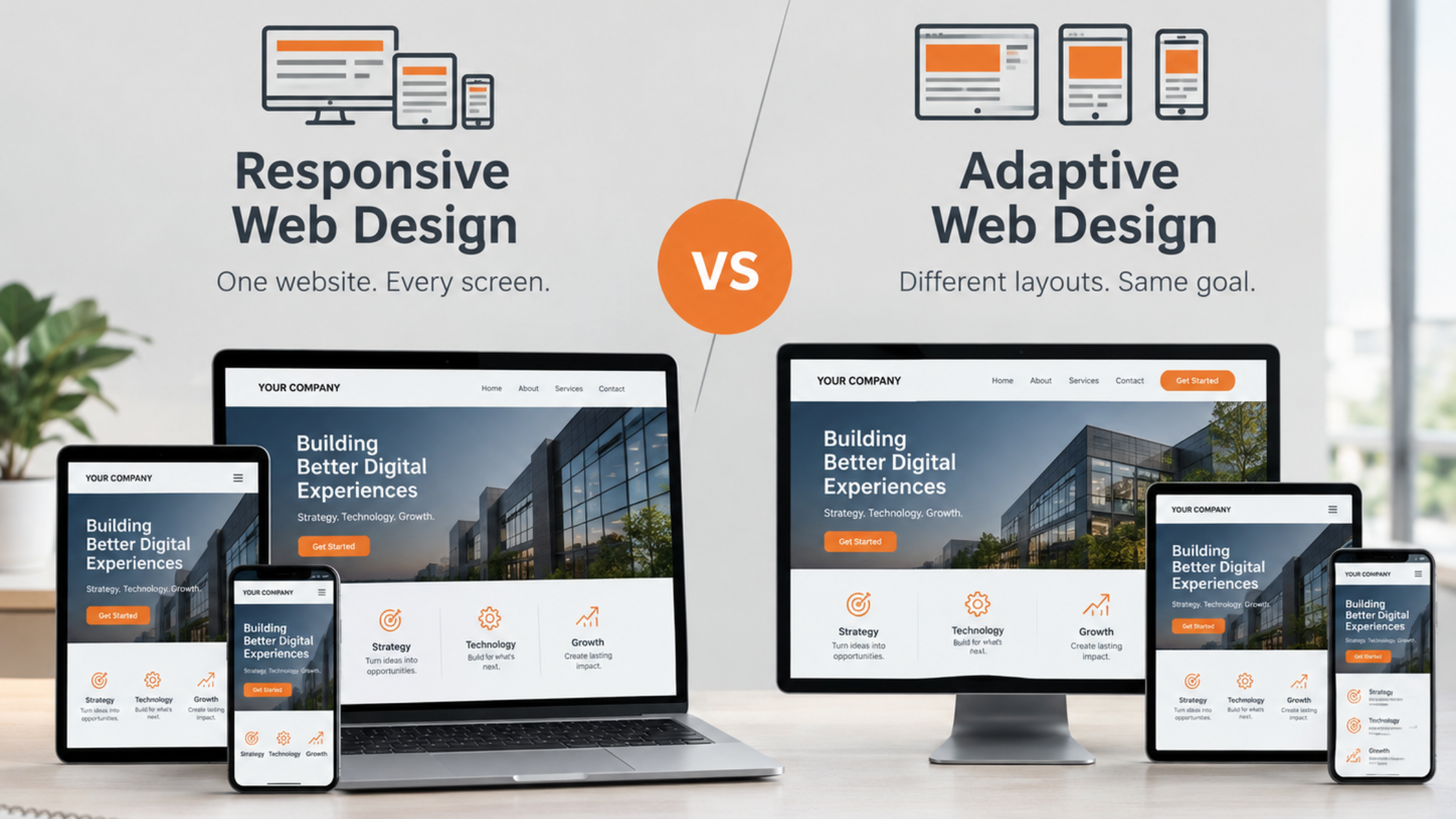
When considering responsive vs adaptive web design, the key difference is whether the layout primarily responds fluidly to available space or uses defined conditions to introduce specific changes.
Responsive design allows a layout to adjust fluidly as the available space changes. Elements can resize, wrap, stack or reposition according to the width of their container or viewport.
Adaptive techniques, by comparison, use defined conditions to make specific changes at particular ranges. A navigation menu might change structure, a two-column section might become one column, or a component might receive different spacing at a particular breakpoint.
Media queries are one of the standard tools used to apply these conditional changes. They can respond to viewport characteristics such as width, height and orientation.
In practice, this means the choice does not have to be either/or.
A site can use a fluid layout across most screen sizes while still having carefully selected breakpoints where the design needs to change more substantially.
Responsive design should provide the flexibility. Breakpoints should provide control where flexibility alone is not enough.
For teams asking what is the difference between responsive and adaptive web design, this distinction is especially useful when deciding which parts of a corporate site should remain fluid and which need more deliberate layout changes.
The biggest advantage of responsive development is that it accounts for the reality of the modern web: there are too many possible viewport sizes to design each one individually.
Google’s web.dev guidance specifically recommends building layouts that adapt to a wide range of screen sizes rather than relying on particular device dimensions. It also recommends choosing breakpoints based on the content rather than popular device sizes.
This matters particularly for corporate websites.
A typical corporate page may contain a combination of:
- Long-form copy
- Calls to action
- Product or service information
- Images and video
- Forms
- Navigation menus
- Client logos
- Tables or data
- Cards and content grids
Each of these elements can respond differently as available space changes.
Consider a section with a heading, several paragraphs and an image displayed side by side. At 1,440px wide, the composition may have plenty of room. At 1,100px, the text may become noticeably narrower. At 900px, the heading could wrap onto additional lines and push the image down. By 600px, the two-column layout may no longer make sense at all.
Simply reducing the padding at each stage may not solve the underlying problem.
The better solution might be to adjust the typography, constrain the text width, change the image behaviour or move to a single-column layout earlier.
Content should determine the breakpoint
One of the most useful principles in responsive development is to let the content determine when the layout needs to change.
It can be tempting to start with familiar device categories:
- Mobile
- Tablet
- Desktop
But those categories do not tell developers when a particular design stops working.
A better approach is to start with the content and resize the layout until something needs to change.
For example, perhaps a navigation bar becomes crowded at 980px. That is a more meaningful breakpoint than choosing 1,024px simply because it is associated with a particular tablet resolution.
The same applies to text.
Text is naturally fluid on the web, but that does not mean every width provides a comfortable reading experience. Typography needs to account for factors such as font size, line length and spacing.
A headline that works beautifully at 1,440px could wrap awkwardly at 900px. A paragraph that is easy to read at 700px might become excessively wide on a large monitor.
The breakpoint should respond to those problems rather than to an arbitrary device label.
Images need to respond too
Images are another reason responsive thinking matters.
Unlike text, images have intrinsic dimensions and can easily overflow a layout if they are not constrained. Responsive image techniques allow images to scale with their containers while maintaining their proportions.
But scaling is not always enough.
An image that looks appropriate beside text on desktop may become too small to communicate anything useful on mobile. In other situations, the subject of an image may be cropped poorly when its dimensions change.
This is where a more adaptive approach can be valuable.
Responsive image techniques such as srcset, sizes and the picture element can allow developers to provide different image resources or compositions for different layout conditions.
The principle is straightforward: the content should remain effective, not simply technically fit the screen.
Where adaptive techniques make sense
There are situations where a fluid responsive approach alone is not enough.
Consider a complex navigation system. It may work comfortably across large screens, but eventually there is not enough room for every item. At that point, the layout may need to switch to a different navigation pattern.
Forms can present a similar challenge. A multi-column form may be efficient on desktop but become difficult to scan and complete on smaller screens. Stacking fields or changing the order of elements may provide a better experience.
The same applies to:
- Complex tables
- Multi-column content
- Large hero sections
- Product comparison components
- Data-heavy interfaces
- Image-led layouts
- Navigation systems
In these situations, a breakpoint can provide a deliberate transition rather than leaving the browser to continuously compress the existing layout.
That is not a failure of responsive design. It is part of responsive design done well.
This is also why responsive web design and adaptive techniques are often complementary rather than competing approaches.
The practical case for a hybrid approach
For many corporate websites, the most practical solution is therefore a hybrid approach.
The underlying layout should be fluid enough to accommodate a broad range of viewport sizes. Specific breakpoints can then introduce significant changes where the content requires them.
This avoids two extremes.
At one end is a rigid, device-specific approach that attempts to create a separate solution for every common screen size. That can become difficult to maintain and leaves gaps between the predefined layouts.
At the other is an overly fluid approach that assumes every component can simply shrink, wrap and scale indefinitely.
Neither is ideal.
A hybrid approach recognises that different components have different requirements.
This flexibility can be particularly useful when developing custom corporate websites, where layouts and components need to reflect the organisation’s specific content and requirements.
Fluid where possible. Deliberate where necessary.
This also helps keep development and maintenance manageable. Instead of accumulating a large number of device-specific exceptions, developers can focus on a smaller number of meaningful layout changes.
QA needs to test the spaces between the breakpoints
A responsive website is not properly tested simply because it works at 375px, 768px and 1,440px.
The spaces between those widths matter.
A page might look perfect at the three approved design resolutions but break at 1,050px because a heading wraps unexpectedly. A navigation item might collide with another at 920px. A card grid might become awkward at 680px before its intended mobile breakpoint is reached.
This is why QA should include intermediate viewport sizes and browser resizing.
Responsive testing can also support website performance optimisation, helping teams identify layout and technical issues that may affect the overall experience across different devices.
Testing should look for questions such as:
- Does text remain readable?
- Do headings wrap naturally?
- Do images maintain useful proportions?
- Does navigation remain usable?
- Are buttons and form fields accessible?
- Does content overflow horizontally?
- Does the visual hierarchy remain clear?
- Do components transition at sensible points?
- Does dynamic or unusually long content change the layout?
This is particularly important for content-managed corporate websites, where editors may add more text, change images or introduce content that was not present in the original design.
The goal is not pixel-perfect sameness
There is sometimes an assumption that responsive development means making a desktop design progressively smaller until it fits a phone.
That is not the right objective.
The purpose of responsive development is to preserve the quality of the experience, not the exact appearance of every design element.
A desktop page might use three columns. A mobile version might use one.
A large navigation bar might become a compact menu.
An image might move above the text rather than sitting beside it.
Spacing might change. Typography might scale. Components might reorganise.
Those differences are expected.
What matters is that the user can understand the content, navigate the site and complete the intended action without unnecessary friction.
In other words, the real goal of responsive vs adaptive web design is not to choose one methodology exclusively, but to use the right technique for each content and layout requirement.
A better way to approach corporate website development
When planning a new corporate website, it is useful to ask:
For businesses planning a new website, corporate website development can provide the structure needed to balance content, usability and responsive behaviour.
- What happens to the content as space decreases?
- Which elements can remain fluid?
Images, containers, typography and spacing can often adapt without requiring a major layout change. - Which components need an explicit transition?
Navigation, complex grids, forms and other structured components may need deliberate breakpoint changes. - Where does the content actually break?
Use the behaviour of the page to determine breakpoints rather than relying solely on device categories. - Has the site been tested between the approved designs?
Resize the browser and test intermediate widths, not just a handful of predefined devices.
The takeaway
For modern corporate websites, responsive development is generally the stronger foundation because it accommodates the enormous variety of viewport sizes users can have.
But responsive does not mean completely fluid or completely free of breakpoints.
The most effective approach is often a combination: allow the overall layout to respond naturally to available space, then use targeted breakpoints when content, usability or visual hierarchy requires a more significant change.
The important shift is to stop thinking primarily in terms of devices and start thinking about content behaviour.
A website should not be designed to look identical at every width. It should be designed to remain readable, usable, balanced and functional as the available space changes.
That is ultimately what good responsive development is trying to achieve.
For anyone still asking what is the difference between responsive and adaptive web design, the answer ultimately comes down to how and when a layout responds: responsive approaches provide fluid flexibility, while adaptive techniques introduce intentional changes when specific conditions are met.
Related Articles




Why Choose Us?
With decades of experience and a dedicated team, we are committed to delivering high-quality web development services. Our client-centric approach ensures that we understand your needs and provide solutions that exceed your expectations.